")
Sometimes going forward is actually a bit backward
Car interiors have changed more in the last five years than they did in the previous twenty. Some of that evolution has been genuinely great: more thoughtful seating, better sound systems, stronger voice commands, improved ergonimics, and features that make daily driving less annoying. But the rush to look futuristic and minimalist also pushed a bunch of bad ideas into production cars, many of which feel less like innovation and more like unforced errors.
Tesla
If you’ve been car shopping lately and found yourself wondering why some changes make the car ownership experience worse, you’re not alone. You can blame the automakers that chased minimalism, cost savings, and tech-forward marketing—sometimes at the expense real-world usability. Here are five interior trends that caused the most frustration.
Ditching the driver’s side instrument cluster
Tesla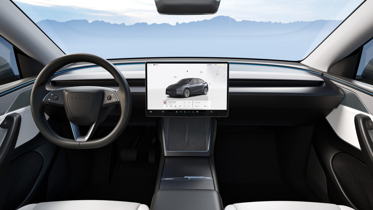
When did the traditional instrument cluster become a bad idea? Well, never, but some designers thought they could fix what wasn’t broken. Speed, fuel, engine temp, warnings—clean, always visible, and readable at a glance, were taken for granted. Over the last few years, we’ve seen more vehicles ditch the traditional cluster entirely, replace it with a tiny sliver of information, or shift everything to a center screen. Tesla is the biggest violator.
It also creates awkward tradeoffs. With a center-mounted speed readout, passengers can see what you’re doing at all times. With a reduced cluster, automakers cram critical alerts into tiny icons or bury them in submenus. Even if the car has a heads-up display, not everyone loves HUDs, and not every trim includes one.
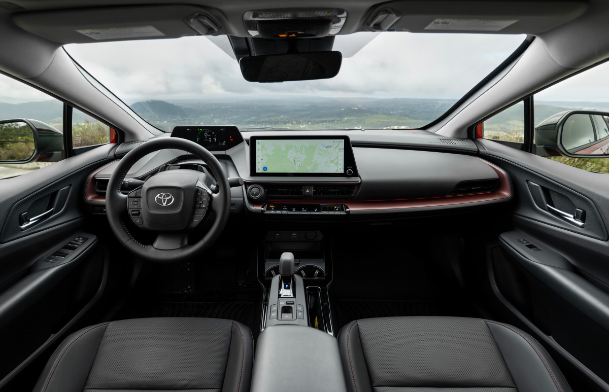
Toyota
What should automakers do instead? Keep a proper driver display, even if it’s digital. It doesn’t need to be flashy. It needs to be legible, consistent, and information-rich without being overwhelming. Give the driver a stable home for speed, range, ADAS status, and warnings, and keep it in the natural sightline. Look what Toyota did with the current Prius. They brought back the instrument cluster. Although it’s small, it’s useful and safe. This is what smart design does: admits its mistakes and corrects them.
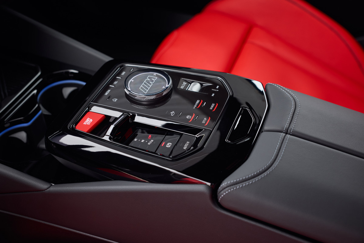
Slider touch controls
Amos Kwon
Capacitive sliders are one of those ideas that seem brilliant inside a design studio and collapse on a cold morning with gloves on. Volume sliders. Temperature sliders. Fan-speed sliders. Sometimes they’re backlit; sometimes they’re not. Sometimes they respond to a gentle brush; other times you have to drag your finger like you’re trying to unlock a phone from 2012.
The problem is feedback—physical feedback, not haptics that buzz after the fact. Real knobs and buttons give you position and resistance. You can adjust them without staring. You can build muscle memory. Sliders remove all of that and replace it with the need to confirm you hit the right spot. Sliders also create the illusion of minimalism while hiding complexity. Instead of “turn the knob two clicks,” it becomes “touch, look, adjust, look again.” That’s not a premium experience; that’s busywork.
The fix is simple. There should be round knobs for volume and temperature, buttons for defrost and fan, and if you must use touch controls, make them big, clearly labeled, and consistent across the lineup. Sliders don’t belong in vehicles because any change in movement renders them inaccurate and distracting. They might look cool, but in no way do they work even decently.
Piano black plastic trim
Piano black trim is the interior equivalent of wearing white sneakers to a muddy festival. It looks great for eight seconds, right up until you use the car like a car. In the last five years, piano black spread like a virus across center consoles, dash trim, door panels, and even steering wheel spokes. It photographs beautifully, which is probably why it became the default. But in real life, it’s quite the opposite. It makes a brand-new cabin look used within a week.
Often, piano black is used as a cheap way to imply luxury. It took off quickly, finding its way into just about every manufacturer’s set of cabin materials. Instead of brushed metal, matte wood, textured composites, or soft-touch materials, you get glossy plastic that reads upscale only in photos. The reality is that they’re just shiny magnets for dust, fingerprints, and scratches.
Automakers should pivot back to matte, textured finishes. If a trim piece is going to be touched daily, it should be durable and forgiving. Satin metallics, lightly grained plastics like the one found in the current Honda Civic, and real texture feel more premium because they stay looking good. A cabin shouldn’t require microfiber cloth maintenance. Get rid of piano black because there are so many better options out there.
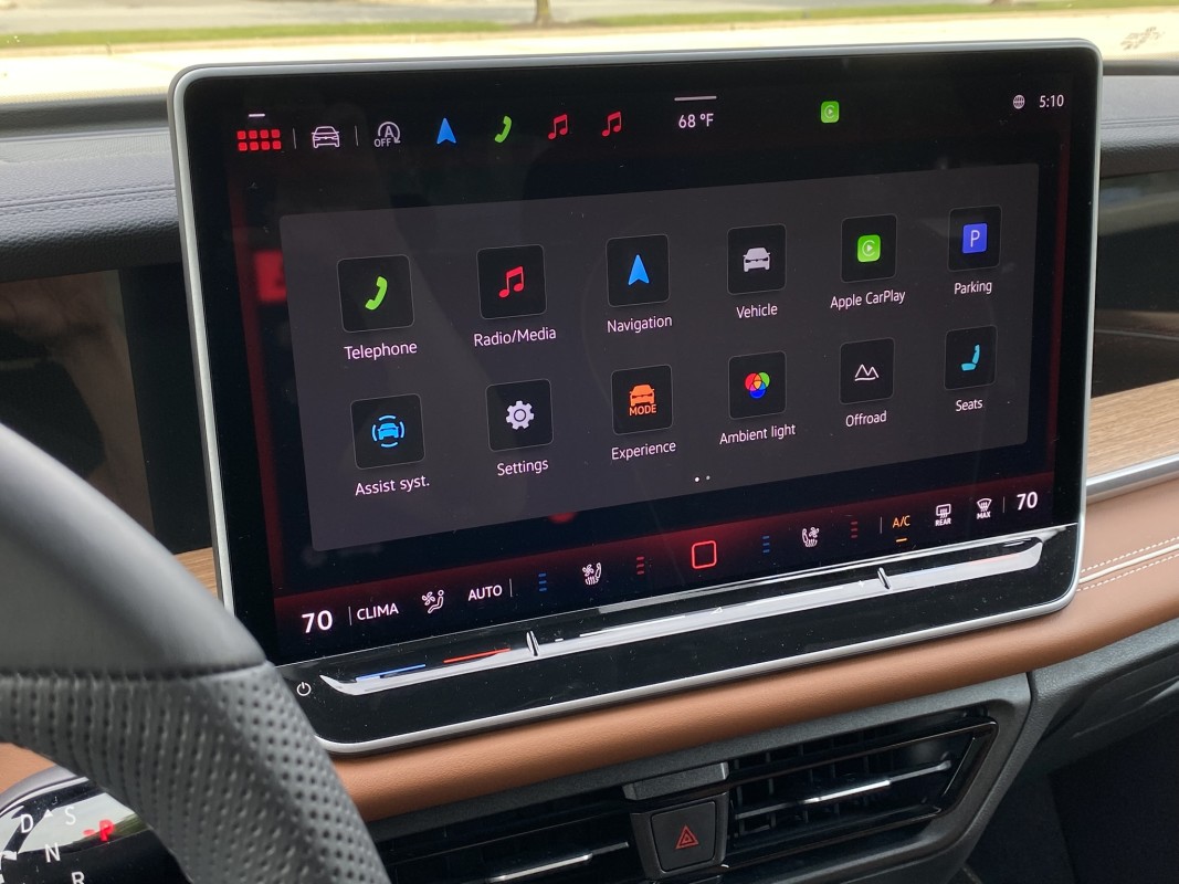
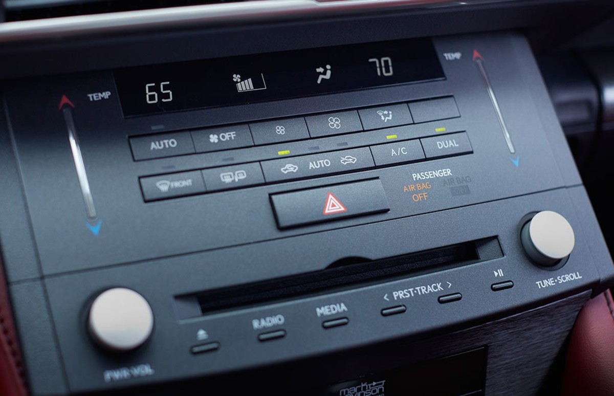
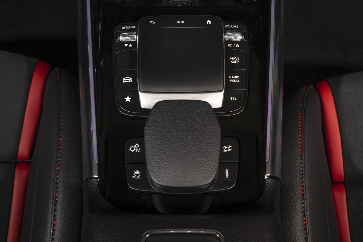
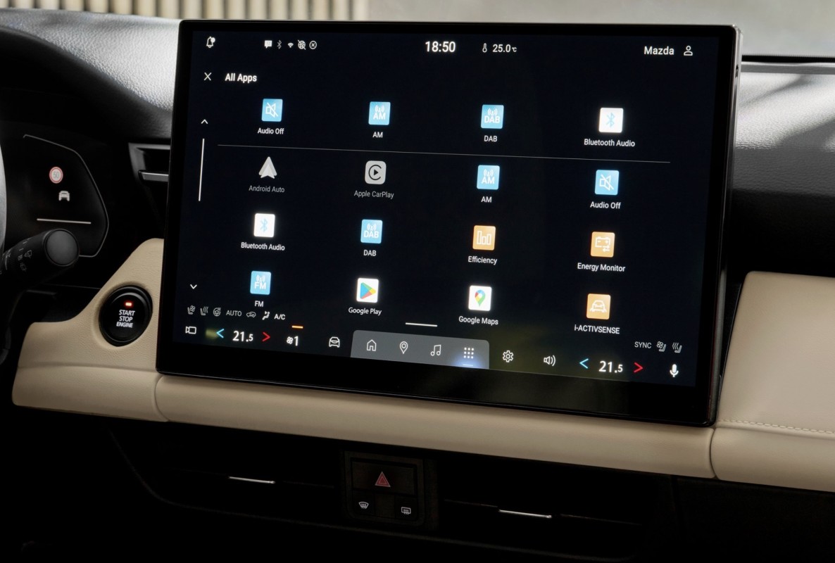
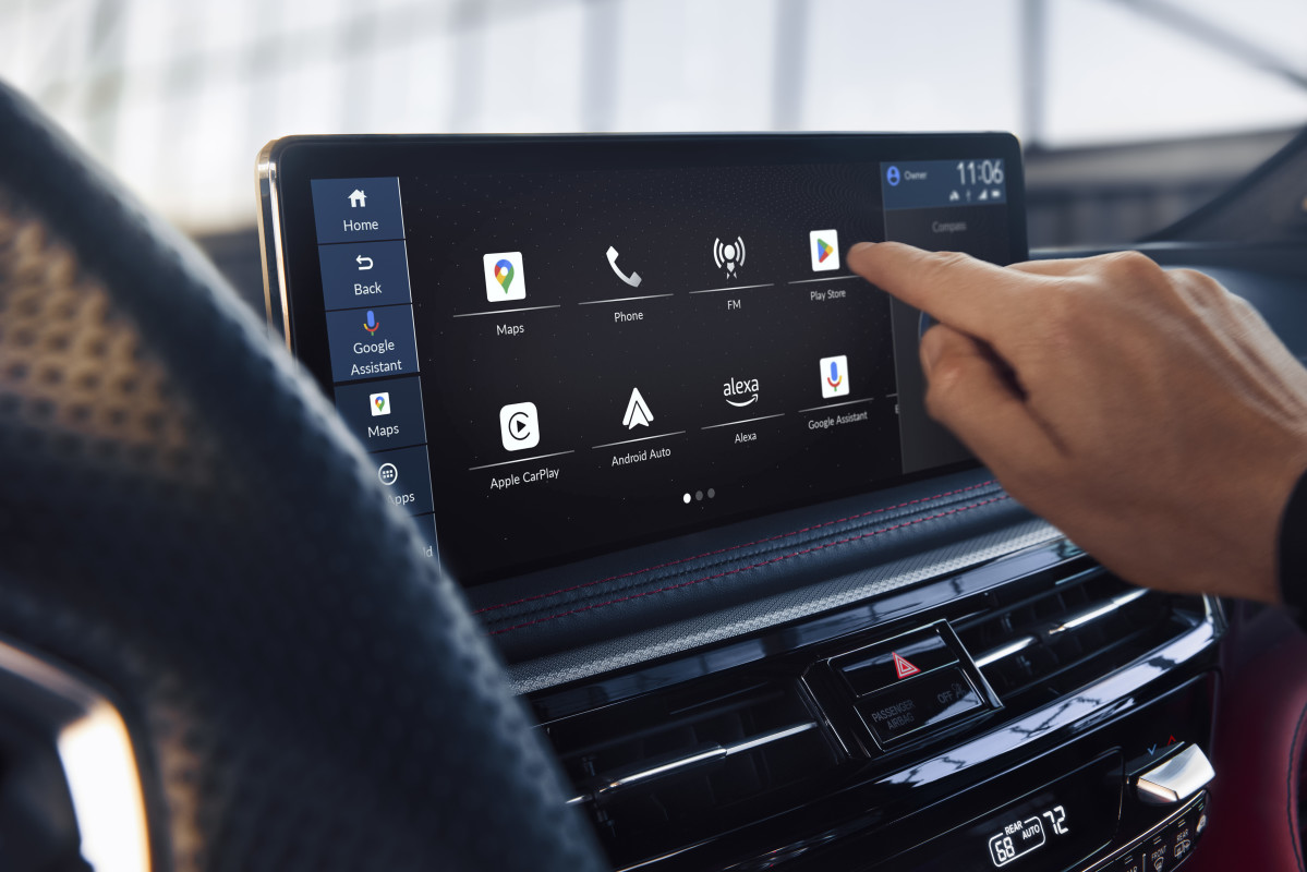
Overdependence on touchscreens
M
Touchscreens aren’t the problem. Touchscreens for everything are the problem. In the last five years, automakers increasingly moved core functions—HVAC, seat heaters, drive modes, even glovebox releases—into touchscreen menus. The logic is easy to see: fewer parts, easier updates, cleaner design, and the promise of “software-defined” everything. But usability suffers when you turn daily tasks into a scavenger hunt. Even one of the bastions of great switchgear, Mazda, has capitulated with its redesigned 2026 CX-5.
Acura
The biggest issue is eyes-off-road time. A physical button can be located by feel. A touchscreen typically requires you to look, aim, and confirm. Even with large icons, the interaction demands more attention. When the screen adds layers (tap a menu, then a sub-menu, then a tiny on-screen button), the distraction multiplies. The second issue is consistency. Buttons are consistent. Software changes. Layouts shift with updates. A setting you could reach quickly yesterday might be buried tomorrow. And if the system lags, freezes, or reboots, you lose access to basic comfort controls.
The solution isn’t to get rid of screens because that’s never going to happen. Instead, wisely blend a touchscreen for navigation, media, and deeper, less frequently used settings, and then incorporate physical controls for the stuff you use constantly: climate, audio, drive modes, heated/cooled seats, and defrost/defog. If you want to be truly premium, make the most-used controls the easiest and most satisfying to operate.
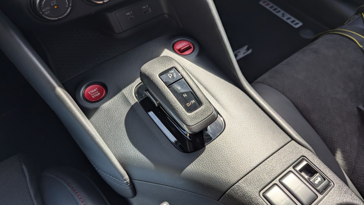
Weird shift controls
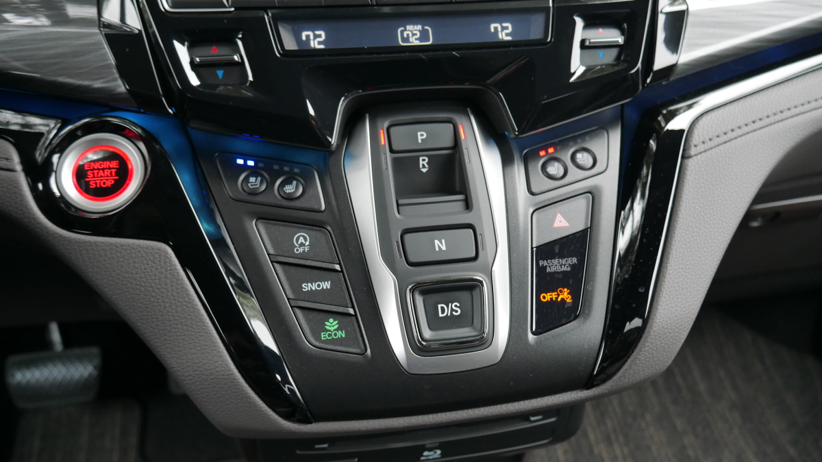
Yes, traditional shifters take up space. Yes, EVs don’t need the same packaging. But shifting is a high-frequency, high-importance action. You do it in parking lots, tight garages, drive-thrus, and chaotic school pickup lines. It needs to be intuitive, unmistakable, and difficult to mess up. Now, there are rotary knobs, column shifters, buttons, and short, fat switches. Automakers have tried everything lately, and not all of it is good.
Some modern shift-by-wire systems are fine—especially when they’re consistent and clearly labeled. The problem is when a design is weird just to be different. Case in point, Nissan/Infiniti’s sliding rectangle. There are three motions: press the button, slide the shifter, and then press “P” to park. Who decided that this was a good idea?
Kristen Brown
Then there are shifters positioned in a place your hand doesn’t naturally go, like the 4 o’clock position on the steering column, a la the Hyundai Ioniq 9. Those designs add hesitation, and hesitation leads to mistakes. Even if the system has safeguards, driver confidence matters. A good shifter lets you operate the car without thinking about the interface. Here’s a test: how quickly can you conduct a 3-point turn? Traditional automatic and manual shifters make quick work of it because you don’t even really need to look. The rest are garbage because they force you to look, and many of them are too slow to shift.
Final thoughts
The frustrating part is that none of these interior misfires are unsolvable. In fact, they’re solvable with the kind of design discipline automakers used to be great at by simply prioritizing driver focus, reducing cognitive overload, and making common tasks easy without looking. Minimalism can be great, and tech can be helpful, but interiors are not smartphones, no matter how cool it may sound. The best cabins in the next five years will be the ones that remember a simple truth: good design enhances the drive rather than detracting from it. That’s the whole point.